Developing Dynamic Designs: How to Use the Psychology of Print for Your Next Marketing Campaign
Did you know that recent studies show that our brains process images 60,000 times faster than they process text? If you apply this to business, it means that the design elements you use in your next print marketing campaign can (and will) have a significant impact on consumer behavior. But how do you know the right colors to use? What about fonts or other design elements? And how can you create a consistent brand identity that resonates with your core audience? Don’t worry. We’re going to cover all that and more as we explore how to develop dynamic designs and explain how to use the psychology of print for your next marketing campaign.
Color Psychology
We can’t discuss the psychology of print without talking about the impact that different colors can have on emotions and decision-making. For example, you’ve probably learned how warm colors like red, yellow, and orange evoke arousal emotions (such as love, passion, happiness, and anger) while cool colors like blue, green, and purple are linked to soothing emotions (such as calmness, comfort, or even sadness). But you may not have known that research shows that 90% of product assessments are based on color and account for 85% of purchase decisions, making it an integral aspect to consider for your next print marketing campaign.
Beyond the colors you use throughout your design, something else to consider is your typography and the readability of your fonts. Right off the bat, if your font is hard to read or visually confusing, your readers will move on (harsh but true). However, if you utilize easy-to-read typography with proper line spacing, your message can come across clearly without getting lost in the shuffle. So, how do you choose a font that will pair well with your marketing materials? If you don’t already have a chosen font in your brand kit, we recommend selecting one font family to keep your typography cohesive. For example, Serif fonts like Times New Roman or Garamond are often preferred for readability, making these options a good starting point. If you do want multiple fonts, we suggest no more than two. You’ll want to use your more “stylish” font sparingly while ensuring there is good contrast between the two fonts you select.
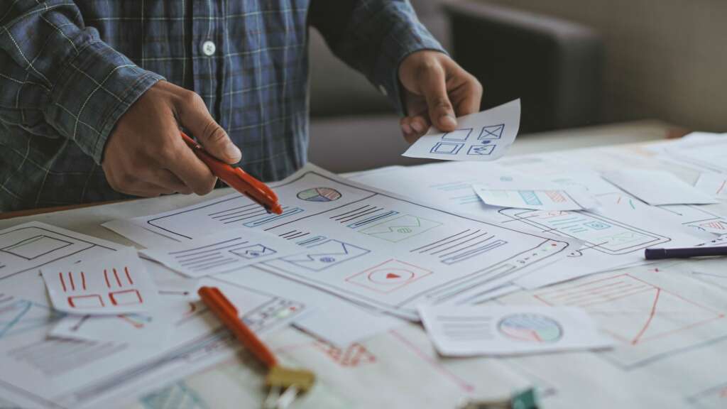
Visual Hierarchy and Design Elements
Now that we’ve covered colors and fonts, it’s time to look deeper at the principles of visual hierarchy in print design. Visual hierarchy refers to the arrangement of certain design elements to show their order of importance. For example, with many of our custom print programs, we will include a photo of the contributor alongside their title and their article to help link the words and images while bolstering their authority and credibility. But these aren’t the only design elements to consider when it comes to visual hierarchy. Something else to think about is your use of additional illustrations and white space. Sometimes, white space gets a bad reputation; however, it’s crucial for both separating and grouping different elements, which helps viewers understand how the design works together as a whole. Not to mention, the smart use of white space can help a design “breathe,” making it come across as more deliberate, well-organized, and professional.
Once you’ve started out on your branding journey, the name of the game is consistency. You don’t want to be changing your font or colors each time you create a new print marketing campaign (although it can be tempting). You need to find what works for your brand and stick with it. Why? Because formulating your own branded visual elements and using them consistently helps convey your business’s identity while enhancing your recognizability for your customers. Consider this: if you were reading one of our blogs from Tulip Media Group and suddenly our colors had changed from red to green and there was a daisy instead of a tulip, you’d probably be confused (and rightfully so). It’s the same principle when it comes to your branding—so keep it simple, on-brand, and consistent!
Subliminal Messaging
Finally, something our clients ask us a lot is, “How can we get our message across without being too obvious?” And the answer is that it depends on the situation. Sometimes, the more obvious, the better; but sometimes, it’s smart to add some subliminal messaging to your print marketing campaign. What do we mean by subliminal messaging? A subliminal message is one that is designed to pass below the normal limits of perception; that is, it is only perceptible to the unconscious or deeper mind. Applied to print marketing, it means there are some subtle design cues that you can implement to convey subliminal messages to your consumers. For example, you may not have noticed that in Amazon’s logo, they have an arrow going from a to z, which is a subtle hint that they’re a one-stop shop for everything you could need, “from a to z.” The most important part here is that you’re not trying to manipulate consumers against their will; you’re trying to incorporate subliminal messaging in an ethical, practical way. So, now all you have to figure out is what you want your subliminal messaging to say.
Ultimately, when developing a dynamic design, there are many factors to consider. Start by analyzing your color psychology and ensure your colors align with your brand’s overall mission and goals. Next, take a look at your fonts and make sure they’re not only spaced properly and legible but that you’re not using too many different fonts. Once you’ve completed those steps, it’s time to analyze your visual hierarchy and other design elements to ensure they’re accurately portraying your message while sticking true to a consistent brand identity. And finally, play around with incorporating some subliminal messaging in your next print marketing campaign (ethically, of course), and see how your customers respond. In the end, knowing how to utilize the psychology of print to meet your goals is something every company needs to understand in order to create dynamic content that resonates with their core customers.