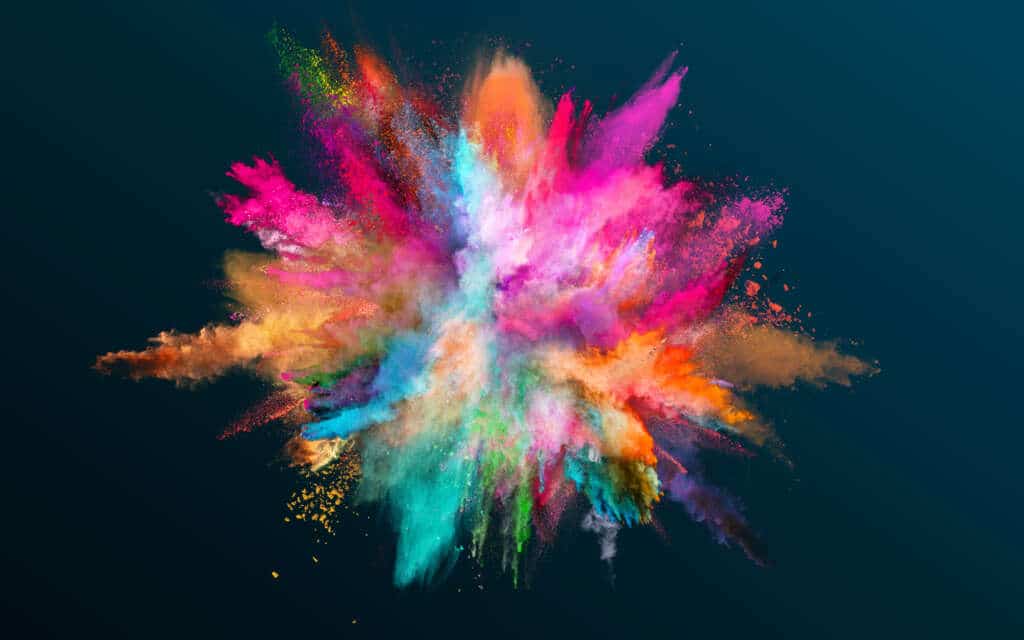
Exploring the Possibilities of Color

From a very young age, we’re taught to explore color. Having children of my own, I’ve always encouraged them to explore every color of the rainbow, from pinks and blues to greys and browns. No colors are “girl” colors or “boy” colors. They aren’t scared of bright colors or of dark colors, either.
Somehow, though, as we age, people tend to gravitate towards more defined groups of colors. We have favourite colors, colors that make us feel safe or happy or a myriad of other emotions. We feel safer expressing ourselves with muted pastels rather than bold shades of purple and gold.
We adults tend to shy away from colors that don’t mesh with our personality or suit our mood. This can leave us with a very limited color repertoire. As a business owner, however, this can impact the persona you create for your business, causing it to become bland and, dare I say, irrelevant.
When designing projects, clients sometimes shy away from bold colors. It’s not so much that they dislike bold colors but that they are so afraid to get the colors wrong that they are dissuaded from using any vivid coloring at all.
Colours say so much about who we are as people and as companies. Some people love the color red because they have a vibrant personality. The same goes for companies that daringly use the color red as a staple in all of their marketing campaigns. A bold shade of red tells a story, conveying strength, passion, and excitement.
Wouldn’t you rather consume from a company you associate with passion, confidence, and strength than from one that tones it down to a pastel shade or a faded grey so as not to step on any toes? Not to say that these tones don’t have their place in the marketing world, but it all comes down to the identity you are trying to create, the way you want your customers to see you.
Successful organizations often choose their colors based on some of the aspects of Feng Shui. The application of Feng Shui methodology in marketing involves the use of color to influence customer decisions by grabbing their attention and triggering emotions that will make them want to consume the product or service advertised.
In other words, these companies utilize the limitless sea of color to communicate fluidly and gain an advantage over competitors.
Colors With Meaning
Feng Shui asserts that colors can act as stimulators—such as red and orange—that uplift us and promote happiness. These colors are commonly used in the food and restaurant industries to grab attention and communicate that element of strength and excitement.
Yellow can symbolize power and health. It is also used to convey warmth and cheer as well as to attract window shoppers and advertise sales.
Pink represents love, romance, and partnership. Pastel shades might be considered delicate, and you can sometimes find them in bakeries. Bolder shades might be combined with other colors to convey an element of youthfulness and fun.
Green represents growth and deep blues are infused with wisdom and introspection. Insurance companies tend to go with blues and greens because they are safe colors that are very calming to people
Purples are heavily rooted in spirituality, adventure, and leadership, while brown offers stability and security.
Black is a contemplative color, which often encourages feelings of reflection and mystery. White, on the other hand, encapsulates clarity, precision, and communication. Grey invites helpfulness and represents harmony.
Each color has its place and the potential to help communicate when we understand how to use them effectively. Instead of shying away from the use of color, we should be using color to convey the key aspects of our brands, our products, and the services we’re offering that words just can’t.
Instead of getting stuck in the habit of using just one or two colors to represent every experience, milestone, product, and sale, try expanding your palette with a little Feng Shui guidance. You might be pleasantly surprised by your customers’ response.
